Making Type: John Roshell of Comicraft & Swell Type

This is the first of a new series where I’m interviewing type designers with questions on design, process, and life beyond the fonts. I have a deep admiration for the people who put in the hours behind the scenes to bring us quality typefaces which we then get to use to bring our designs to life.
First up in Making Type we have John Roshell who I’ve had the pleasure of spending time with at a few conferences in the past year. We also had him give our team a very engaging talk a few years back. John is behind the many, many stellar comic book fonts of Comicraft, and also the California inspired Swell Type.
What was the initial spark that got you into type?
I can remember a few key moments — as a kid, buying a sheet of Letraset rub-on letters (MICROGRAMMA, still the Best Font of All Time), which I would blow up huge on the copier to make flyers and stickers for my band. And in my high school job, opening Adobe Illustrator and discovering a whole MENU of fonts available! And then just after college, my first week working for some comic book letterer named Richard Starkings, he asked if I could figure out what was causing the holes in the number “8” in his font not to show up. Opening Fontographer for the first time was like opening the portal to another dimension… I could actually… MAKE fonts??
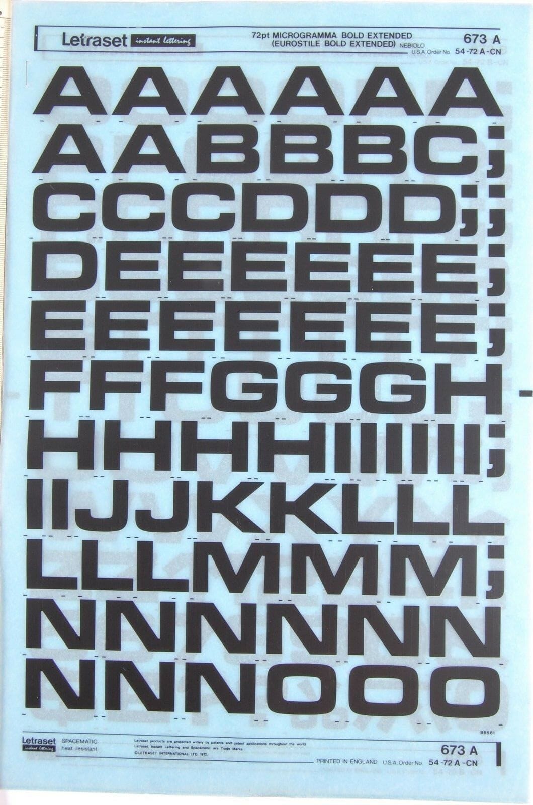
Microgramma Letraset | Richard Starkings’ early font
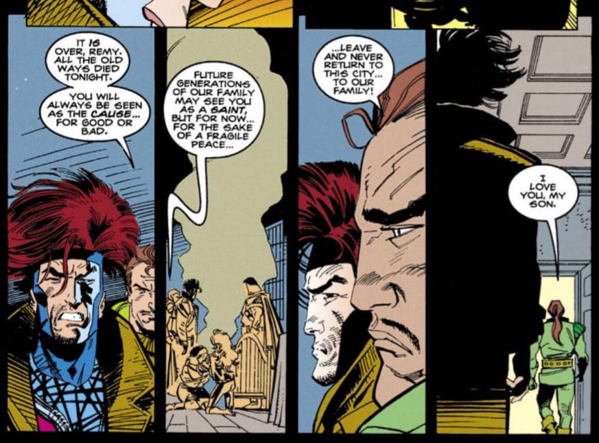
Comicraft helped pioneer the move into the digital age for comic book lettering and now has such a wealth of fonts spanning more than 30 years. How did that transition from lettering influence how you make fonts?
In the process of creating his font, Richard had let the computer do what computers like to do, which is draw straight lines and perfect circles. So the idealized version of his lettering looked nothing like his ACTUAL lettering! Because I was able to quickly fix his troublesome “8”, he let me go in to make some tweaks to try to get his font looking more like his actual lettering. And when that still didn’t look quite right, I started from scratch to create my first complete font. That font (now called "Hedge Backwards”) looked enough like his pen lettering that our editors couldn’t tell the difference, which led to he and I being able to work on books simultaneously, and eventually bring on additional people to turn books around faster than any single letterer previously could.
Our reputation for deadline-beating and quality led to us getting more and more work, and moving onto top-selling books like Spider-Man and the X-Men. When we reached that point, we decided we couldn’t continue lettering everything with his font, and we began creating fresh styles for each series. On top of that, we needed fonts for sound effects, story titles and villain voices, so I was making fonts like crazy. I would start a font in the morning, get A–Z and punctuation working, and it would go out on pages in Fedex by the end of the day! This led to a huge backlog of partially completed fonts, some of which I’m rediscovering and bringing to completion 30 years on.

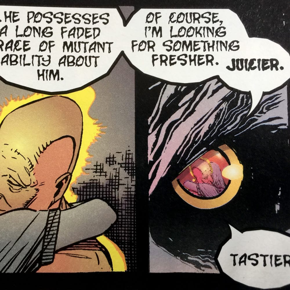
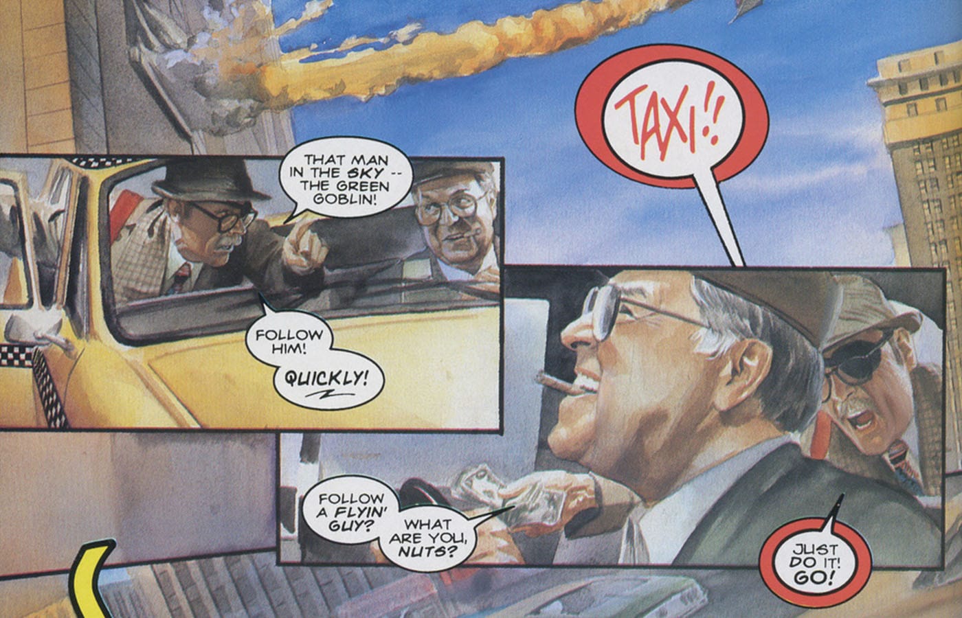
Pen lettering vs Font for 'Villain Voice' used in Generation X
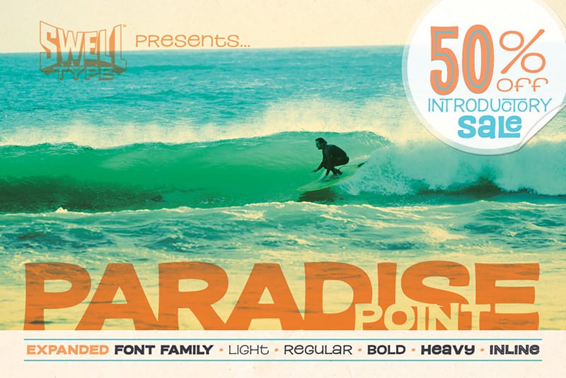
You formed Swell Type more recently to design type based on inspiration from California. What’s your process from seeing something in your surroundings to bringing it to life as a font?
Swell Type came from my desire to design larger, more “typographic" families that didn’t fit under the comic book umbrella. I’m always taking pictures of letters for inspiration wherever I go. Since I’ve lived in California my whole life — born and raised in the San Francisco bay area, went college at UCLA and then spent the last 30 years in Santa Barbara raising our family — California seemed like a good way to describe my influences. Plus it’s fun to make surf graphics.
We’ve talked before about how much work goes into designing your font specimens. Does that process also influence your typefaces themselves?
Creating a font, especially a large family, is a real act of faith. A lot of work goes in without having any idea if anyone else will find it useful enough to want to give you money for it! Thinking about the specimens in the early stages is a good exercise — if there are situations I can imagine using them, then hopefully there will be an audience for it. And at the end, creating the specimens is a great beta test — as I work on them, I’m constantly going back in to make little tweaks and hopefully get them perfectly dialed in.
You’ve created many variable fonts. How has this technology changed the way you think about type design?
Now I find it hard to not think about a font in terms of how skinny, how thick, how narrow and how wide I could possibly make it. Maybe every font doesn’t need to have 72 weights, John… but they COULD.
Even after such a prolific career, with high profile custom type and frequent real-world font usage, do you still have moments where you spot your work in-use and get excited?
Every time! Spotting my fonts in the wild never, ever gets old. My family might beg to differ… “Yes, dad, your font is on that cereal box.” “No, honey, you may not buy Fruit Loops.”
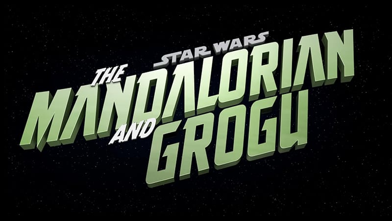
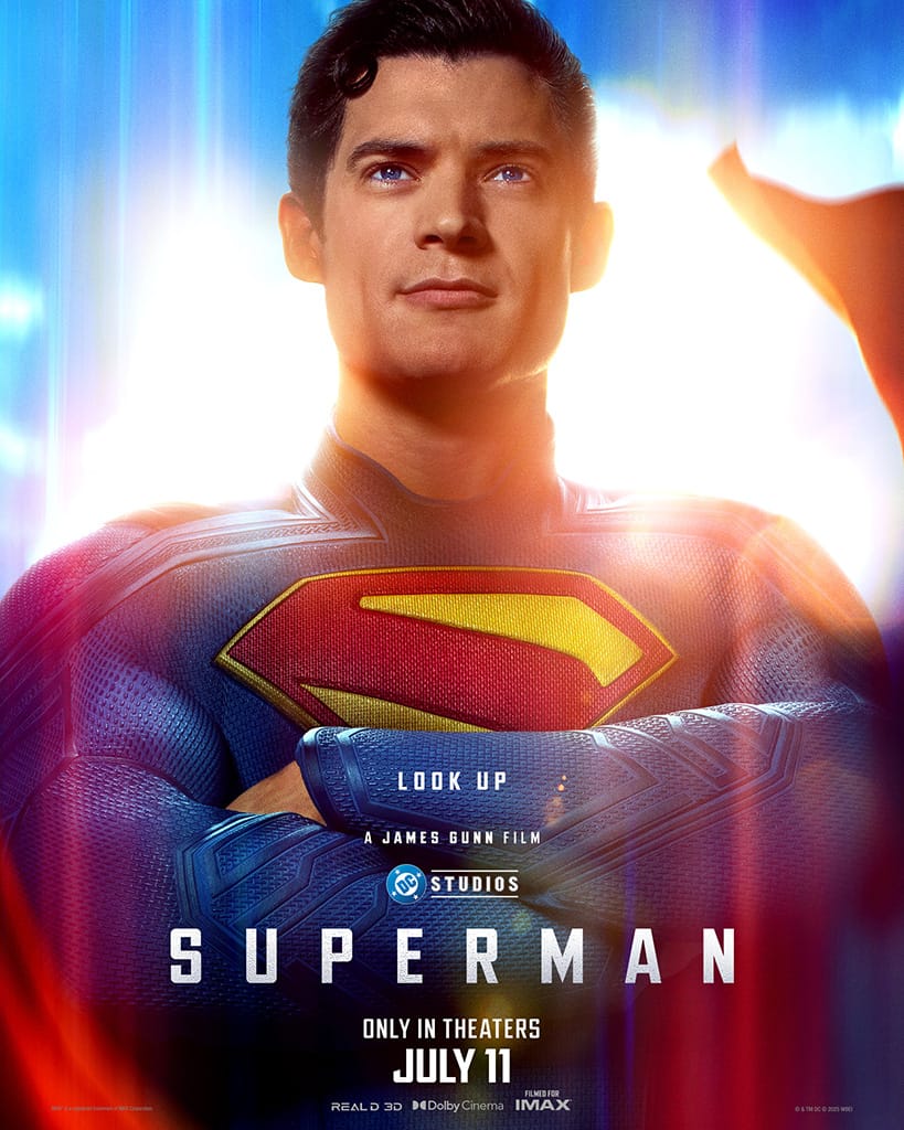
2025 was pretty exciting — ULTIMATUM was the main font on the Superman movie posters, and THE STORY SO FAR and MONSTER MASH form the logo for the new Star Wars: Mandalorian and Grogu series!
How do you stay creatively satisfied?
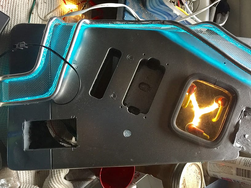
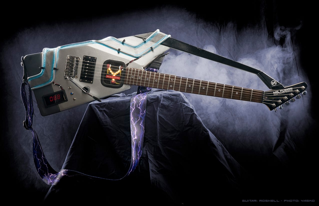
After a while in front of the screen, I like to go out in the garage and get my hands on physical stuff like wood and metal. I’m a lifelong guitarist and have built guitars, speaker cabinets, effects pedals and many, many pedalboards. This year, my wife and I sold our tract house in the suburbs and moved to a little 100 year old Craftsman downtown. So that's meant several months of glorious house projects, from painting walls to wiring outlets, moving doors and vaulting ceilings. After a few hours of that, I start thinking about a font I want to work on, and the cycle begins anew.
Thanks so much to John for taking the time to answer my questions. You can find his fonts on Adobe Fonts at Comicraft and Swell Type, and directly on the foundry websites — Comicraft & Swell Type.