
Sabrina Carpenter: Short n’ Sweet tour fonts

I researched and wrote most of this last year but never got around to posting it — so now that Sabrina has finished part two of her tour, here it is!
My Taylor Swift’s font usage posts are by far and away the most viewed on this blog so I guess I’m going to keep putting wildly unnecessary effort in scouring the internet to find the design choices of pop stars so you don’t have to.
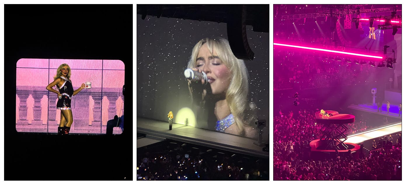
Last year I went to see Sabrina Carpenter live in Los Angeles as part of her Short n’ Sweet tour. I’d been hooked on Espresso since it was released and loved that she found her voice with the album. I wasn’t surprised when she turned out to be my most played artist for 2024 after the number of times I had the album on repeat.
The tour was clearly inspired by the 1970’s, with the shows rocking a trendy nostalgia driven vibe for the graphics, set, and even pre-show hold music. It’s been fun looking back at the photos I took and digging into a little of what the design team must have been thinking. They’ve definitely taken a similar vibe into the Man's Best Friend album design and maybe I’ll look into that too at some point. Friends who have gone to part two of the tour this year have confirmed that the designs remained the same, with just a few song additions from the new album.
The fonts are likely from a mix of sources including Adobe Fonts, Creative Market, and MyFonts. I’ll drop links for where you can find the fonts and some similar recommendations if you’re just going after the same vibe.
Ok, let’s dig in!
Citadel Script and Times New Roman
This graphic has been used for various media around the album. Citadel Script is based on engrosser’s script style calligraphy and is featured as a go-to font for the album. Unfortunately it didn’t make it everywhere with much of the album merch also using vaguely similar script fonts.
Times New Roman in all caps is actually pretty nice, and very recognizable. What is interesting is this uses the Extra Bold weight which isn’t as common as doesn’t come installed by default on computers. If you just want something close, of course you can use Times New Roman Bold which you will already have.
Aside: the use of n’ somewhat bothers me typographically — it should technically be ’n’ to denote the missing ‘a’ and ‘d’ — but I get that the single apostrophe is used more often than not.
Alterations
A bunch of little tweaks have been made to the Sabrina Carpenter text, so not all of the credit here actually goes to Citadel Script (shown on top here). Curiously, the ‘S’ has been swapped in from Filmotype York. Other letters have had swashes added, parts lopped off, or been rotated. Maybe the S was a little too ornate and the bowl at the top a little too tight? Maybe the C looked a little too like a G without rotating it slightly? We can probably assume the aim here was slightly better legibility overall, though I’m not sure all the tweaks (shown in red) were needed. It’s always so interesting to see what goes into these designs behind the scenes. I’d love to know what conversations were had!
If you want a similar alternative, I would go for Sweet Fancy Script which is included on Adobe Fonts.
8, Blakely, and Minetto
This graphic was featured on the exterior of the stadium, and I have seen a version of it used on a poster too. It features a trio of fonts all available on Adobe Fonts which work nicely together to continue the vintage styling.
Eight from CAST is the fun chunky font, and has the addition of the heart instead of the counter of the ‘o’. Blakely from Mark Simonson Studio is the Art Deco inspired all cap font. Last but not least the variable font Minetto from Dalton Maag is used in a few weights.
Tango, Bright, and Avant Garde Gothic
Throughout the show there are short video interludes featuring various incarnations of The Short n’ Sweet Show / TV. I hadn’t come across Tango in use before this. I love the ‘soft serif’ style as I like to call this which is accentuated with the swash capitals. The lock-up used for each sits the two S’s together and slightly larger than the rest of the text.
For the first, Tango is paired with another serif Bright (which I had to scour Creative Market to find). It is equally packed with character with the alternate characters available, but those weren’t used here as it plays a secondary role.
The TV version instead features Avant Garde Gothic for the subtitle and is also used inverted + warped to give the rounding effect of an old school television.
Marvin Visions
The Sabrina After Dark risqué portion of the show features Marvin Visions by Mathieu Triay which is jam packed with ’60s oomph. I’m not going to say much more about it other than you should really click on that link and go read the amazing page all about how the font was revived from the original source material and modernized into an incredible variable font. It’s always fun when there is an opportunity to use alternate characters to such good effect as here with the two As facing opposite directions in Sabrina.
University Roman
For the ‘SC’ initials logo (which I have somewhat sloppily attempted to recreate here) it looks most likely that University Roman (or one of the other similar versions, like Celtic which is available on Adobe Fonts) was probably the basis and then some tweaks were made.
Funnily enough I feel like I keep coming across this font in random places, like in a thrift store in Tokyo on an Individualized Shirts label and on the store sign for the Solvang Bakery in California.
Alterations
Ok here is my take on the tweaks made to get to the final version. The S was made bigger and the two characters overlapped. The spurs on the top right of the letters were removed. The tail of the S was duplicated and added to the end of the C. Then the swirl of the S was enlarged and it all smoothed out a little.
All of that... or maybe the just found a different cut of this font given there are a bunch of different historical versions. Anyway I think it’s pretty nifty. It works nicely alongside all the rest of the script and vintage style type.
That’s a wrap! Let me know if you’re interested in any more on Sabrina Carpenter’s font uses!