Taylor Swift: fonts through the eras

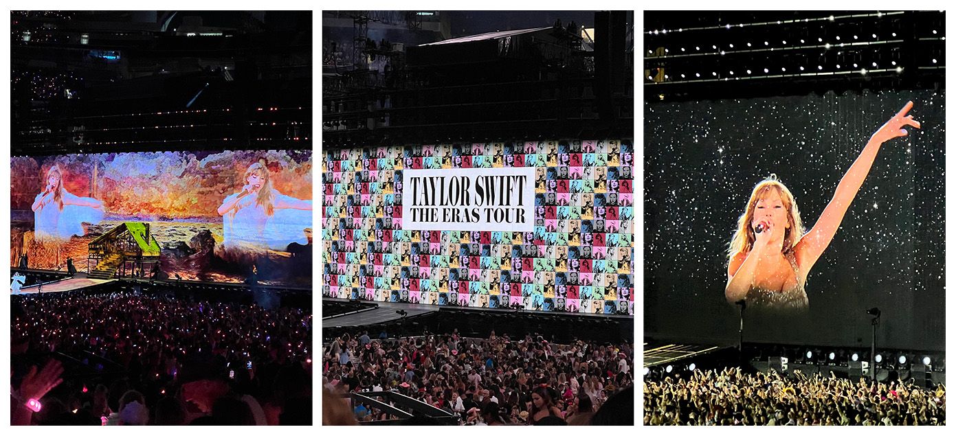
I was lucky enough to go see The Eras Tour while Taylor Swift was playing in Los Angeles and that lead me down the path of spending too many hours making this post. As with every detail about Taylor Swift, the fonts she’s used have been scrutinized and questioned online. Even so it took me a while to unearth them all as there were a lot of not-quite-right red herrings posted. So here goes my attempt!
Taylor isn’t known for sticking to the status quo, and she doesn’t hesitate to push typographic boundaries either. The classic ‘should I only use two fonts?’ question came up while I was on our livestream last week. This is typically one of the well known typography ‘rules’—to which I say as long as you have a good reason to do so this should be ignored. Taylor and her creative team use a bunch of fonts across the album artworks, track listings, marketing materials, videos, and merch. Often combining multiple fonts and making it look seamless.
For this post I won’t go into all the minute details, but focus on the main fonts used for each of the albums and The Eras Tour itself. I’m offering suggestions for the closest available options on Adobe Fonts, as well as the original choices (for those which aren’t lettering). Use these as inspiration to bring a bit of Taylor magic to your designs!
The Eras Tour
✅ Match! Eloquent JF Pro Regular (scaled)
Another, and more contentious, breaking of the typographic rules here in the use of horizontally scaling to squish Eloquent to make this type lock-up. To achieve this you will need to use Photoshop or Illustrator and use the Horizontal Scale feature in the Character Panel. The top row (‘TAYLOR SWIFT’) is scaled to 45% and the bottom row (‘THE ERAS TOUR’) is scaled to 87%.
While I don’t think this was technically the best approach to get this look as there are plenty of options for Didone or ‘modern’ style serifs which have a condensed width too and could have been used rather than manipulating the characters, I didn’t even notice until I got to try to match it. Heck, I even bought a t-shirt with it on so you got me, Taylor—keep breaking the rules.
(Perhaps boring side note here: the reason this typically isn’t advised is the same reason you wouldn’t just smoosh an image horizontally and hope it still looked good. You’ll notice here the thins parts of the characters are almost breaking apart in some places. Type designers put in a lot of thought as to how the thicks/thins of letters work together and in overriding those decisions comes risks.)
Taylor Swift
🔀 Similar: Goskar Variable
Now given this also served as Taylor’s logo of sorts you may want to get your hands on the real deal. If so ✅ Satisfaction is what you are after. You can get a similar vibe with Goskar if you pick some of the alternate characters available in the font and scale up the capitals. As this is a Variable font, you can also lower the weight of the larger capitals to match the lowercase.
Fearless
🔀 Similar: Sweet Sans Pro Bold
There are a number of similar wide sans serif fonts which you could use to emulate a similar vibe here: Sweet Sans being the closest I could find. Fonts In Use identifies the original used here as ✅ ITC Blair.
Fearless (Taylor’s Version)
🔄 Similar-ish: Quiche Sans Medium
I was surprised at how few high-contrast sans serifs matched the vibe of the actual font used here: ✅ Carla Sans. I’m instead now going to gush over how much I’m liking Carla and most of all that big old bowl in the capital ‘R’. It was really difficult to find a good suggestion here.
Speak Now
✅ Match! Sudestada (modified)
We have a hit, but there’s a catch. The ‘S’, ‘p’, ‘k’, and ‘N’ were, I believe, all modified manually in the artwork. There are some ideas floating around the web that a second font was also used and switched in for those characters but I don’t see it. The version on the album cover takes the structure of these characters and tweaks them. The bowl of the ‘p’ was filled, the frills of the ‘k’ were removed and replaced to be more conventional, and the big loop at the start of the ‘N’ was lopped off. The ‘S’ does seem to be entirely custom.
Speak Now (Taylor’s Version)
✅ Match! Mina (modified)
Again we see a couple of slight modifications here to the ‘p’ and the ‘o’. I think we can assume that legibility is top of mind with these script options and someone (Taylor?) is making the call to tweak them to make the titles easily readable. Here I actually think they missed a trick with the ‘p’ which again they modified to add the bowl, as there is an alternate character in the font (shown in the image above!) which does this already. There is no alternate ‘o’, so fair enough in wanting the connection to be a little clearer.
Red
🔀 Similar: Kaneda Gothic Extrabold
In the world of bold condensed sans serif fonts, Bebas Neue has perhaps of late become the most prevalent and could well be used here for the same effect, but Kaneda Gothic, also from Dharma Type, is a little closer in details to the original font: ✅ Tungsten.
Red (Taylor’s Version)
🔀 Similar: Good Headline Pro Comp News Italic (modified)
Things get interesting here, with the original choice remaining ❓Unidentified. I think the manual modifications are throwing folks off as the internal rounded corners make it look as though it should be a rounded font—but the exterior corners remain square (which leads me to think it has been tweaked in Illustrator). Another thing with this artwork is the rest of the text is also Italic and again we see Carla Sans used for the ‘TAYLOR’S VERSION’ text but it has been manually slanted as there is no Italic version of Carla. So it could well be that all of the text has been slanted and what we are looking for is a pretty regular condensed sans serif.
That’s a long way of saying I don’t know what it is, but the closest I can get is to use Good Headline in the ‘Comp News Italic’ style then manually round the interior corners. The ‘R’ is slightly too narrow though.
1989
🔄 Similar-ish: Permanent Marker
The marker pen text used for the album is most likely ✅ Custom lettering, and I really don’t see much value for it to have used a font as you can get a much more lifelike feel to the text by doing so. If you are in need of something to quickly get a similar feel, Permanent Marker is likely your best bet to get that chunky marker pen style.
1989 (Taylor’s Version)
🔄 Similar-ish: Smoothy & Moonblossom
Again for Taylors version of 1989 we can see some more ✅ Custom lettering, this time a slightly different version (drawn by someone else, or the same person with a different pen?) but we do of course have the addition of the ‘TAYLOR’S VERSION’ text too. Given so far for all the TV albums Carla Sans has been used, I think it would be a reasonable guess that this is hand lettered version based on Carla.
Again replicating lettering with fonts is always tricky so these options are some suggestions to give a similar feel. I cheated a little with 1989 and used a capital ‘I’ for the 1 as it matched closer.
Reputation
🔀 Similar: Amador (scaled)
It was another bold move from Taylor to use Blackletter type for the artwork for reputation which have largely fallen out of favor. Given the rest of the typography from the album, the aim was likely to emulate the style of print newspapers—but was somewhat critically received at the time. I think looking at it now it feels less controversial, but it definitely stood out at the time. The font used was ✅ Engravers Old English which was modified to remove some of the serifs. Amador is a reasonable match to what they ended up with, if you make it a little wider with the horizontal scaling to 125% (again, not typically recommended).
Lover
🔀 Similar: MrsSaintDelafield Pro
The script for Lover seems to be widely agreed as ✅ Custom lettering. After a lot of searching the closest option I can find is from the Bluemlein Script Collection from Sudtipos, which is full of a bunch of hidden gem script fonts. Using Mrs Saint Delafield with a few of the alternate characters available in the font lets you get very similar vibe—especially matching the loops of the ‘L’ and the long tail on the ‘r’.
Folklore & Evermore
✅ Match! IM FELL DW Pica Italic
Both of Taylor’s albums from 2020 use the same typography and use one of the ‘Fell Types’ which replicates the ink spread from when metal type was printed on paper (hence the jagged edges). This brings some more life to the text and feels less mechanical than typical digital serif fonts—perhaps an overall theme of Taylor’s, often opting for script fonts and lettering.
Midnights
✅ Match! Neue Haas Grotesk Display 65 Medium
This one may look familiar to you as it was the precursor to the widely popular Helvetica. The main visual difference between this display style vs Helvetica is it is slightly more condensed. The other detail of note from the typesetting is the nice use of a gradient within the text.
The Tortured Poets Department
✅ Match! Big Caslon (modified)
[Updated Feb 5th 2024] With the latest album announcement from Taylor at the Grammys we have another font to uncover! We’ve switched gears here a little from the stark cleanness of the Midnights sans-serif choice to a more classic serif font. Again though we see some slight modifications to bring a more hand-made / aged feel to the text. Big Caslon is one version of many ‘Caslons’ which are reproductions of the style from William Caslon in the 18th century. There are some versions which have the printed style imperfections built in, but the treatment on the cover is most clearly Big Caslon with some manual modifications. (I also am confident in this given it is also being used on Taylor’s website too.)
The Life of a Showgirl
✅ Match! Gazetta Variable
[Updated Aug 13th 2025] TS 12 is almost here! Looks like we have an exact match this time, albeit mostly used covered in orange glitter! Gazetta Variable Slanted is used in what looks to be a custom weight between Light Italic and Italic. I make it out to be 370. If this is the first time you are encountering a variable font, effectively this is a superpowered font which lets you have more control — for Gazetta it gives a weight axis where you can choose exactly how thick you want the characters.
You may notice this font choice goes back a little way towards the Red (TV) styling. Overall I think this text treatment is handled better though. Kudos Taylor’s design team, as always!
Phew, that’s a wrap! I’ll aim to keep this post up-to-date as more albums come too.