
Adobe Firefly Text Effects

AI has taken the world by storm in the past year and has undeniably changed the game in the world of creativity. I think it’s key to think of the technology as a tool for creators to use in our methaphorical art department, rather than it being the be-all and end-all. As with any tool, the most important thing is knowing how and when to use it. As the old saying goes, when all you have is a hammer, everything looks like a nail.
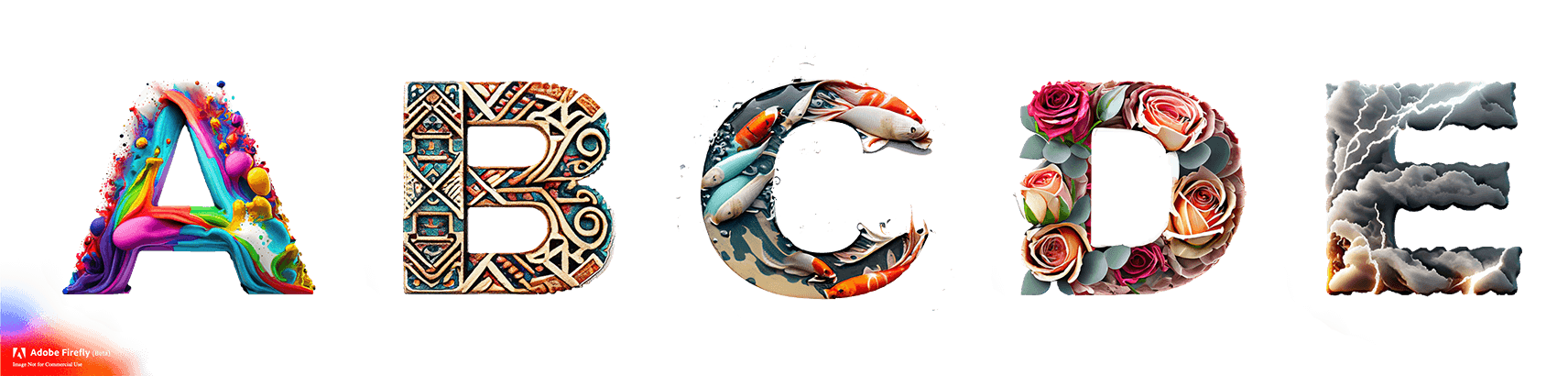
When it comes to the Text Effects feature, one of the original capabilities in the Adobe Firefly Beta, to me this is really all about bringing some whimsy to your designs. Remember the joy of Word Art in the ’90s? Sure it was used everywhere and we all ended up over using it, but it was all we had! Now you can pick anything at all in your imagination and make some text look like that.
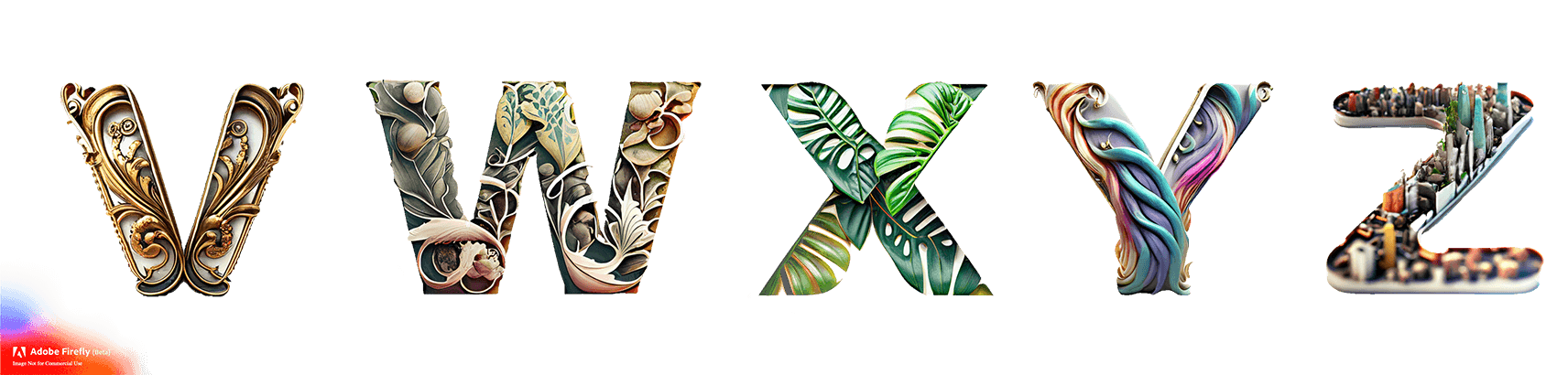
The feature takes the often referred to ‘text-to-image’ approach of generative art which lets you type in some text as a prompt for the machines to style your output. In this case instead of it being an image, it is applied as an effect on to your live text. This means that when you use it in the new Adobe Express, for example, it keeps it all as fully editable text so you can later go back and edit any other properties (letter spacing, font style etc) as you need—pretty neat!
Whether you use it on the Firefly website or within Express, you will get a bunch of preset ideas you can try out to get a feel for what prompts will give you and some descriptive words you can add.
My top tips to get the most out of Text Effects:
- The bigger the better. I’ve found you’ll get the best results on a short piece of text set pretty large. As with a lot of things, less is often more. Think about what you want this to add to your designs.
- Make it bold. The bolder the weight of the font, the more area you’ll have to play with. Sometimes light weights turn out great but you’ll need to experiment more.
- Illustration meets type. It’s best to think of this as a mix between text and illustration. If you want to use it purely as either it can be frustrating to make work. Reframe how you think about it and you can get a lot out of it.
- Get descriptive. The more words you use, the more detailed the results will get. Think about synonyms or additional words you can use to describe what you have in mind and add them to the prompt.
- Play with it! This is the most important, set aside some time and play. This is a really fun feature and you need a bit of play to find the areas where you will get some great uses cases from.
Another fun thing to play with as a little hidden feature is to style your own emoji. You can copy/paste in any character to the editor on the Firefly website and apply the Effect to it, so you can end up with some really fun emoji to add to your Slack etc.

Bonus
Last week I was a guest star for the second time on our Adobe Fonts livestream talking all about Text Effects! You can rewatch the episode here: