Design exercise: Chobani × La Colombe

This week the design industries’ favorite yogurt brand, Chobani, has bought the coffee roasters La Colombe. I thought it would be a fun exercise to mash-up how they use type in their branding to see what a future logo could look like. I’d guess that they will keep the brands distinct for the time being but I really dig both approaches so why not see what works well about them too.
Chobani’s rebranding back in late 2017 was a breath of fresh air at the time in a sea of ‘blanding’. When it felt like every other brand was gravitating towards simple clean sans serif type, it stood out with its bold nostalgic soft serif approach with their logotype and custom fonts designed by Commercial Type.
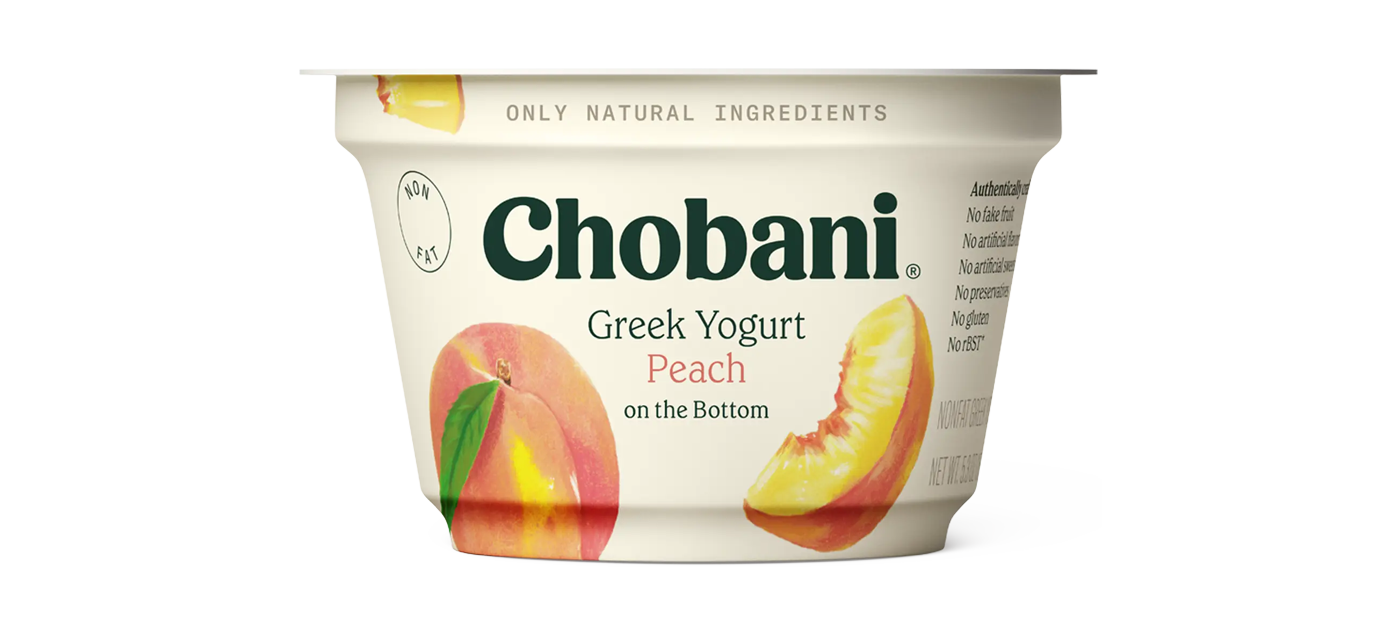
It was one of the first of many to be inspired by the quirky serifs of the early 20th century like Windsor, Clearface, and Souvenir. Modernizing those characterful serifs also became a hit within the type industry, likely not directly because of this work but definitely encouraged by the mainstream popularity. Nostalgia, or even perhaps ‘anemoia’, has continued to thrive as a driving force of many high profile rebrands in the past 5 years with retro type being a big factor.
If you want to get a similar vibe there are lots of great options available on Adobe Fonts, here are a few of my picks:
Gelica from Dave Rowland Type, Roca from My Creative Land, New Spirit from Newlyn, Fields from Adam Ladd, New Kansas from Newlyn, and Etna from Mark Simonson Studio.
The La Colombe logo uses Coquette from Mark Simonson Studio and Brothers from Emigre (and I believe Montserrat from Google as the tagline beneath). I love this pairing and how it combines the soft swoosh of the ‘L’ with the angular industrial look of the all caps letterforms. It’s giving approachable trendy warehouse vibes—perfect for a hip coffee shop? I think so.
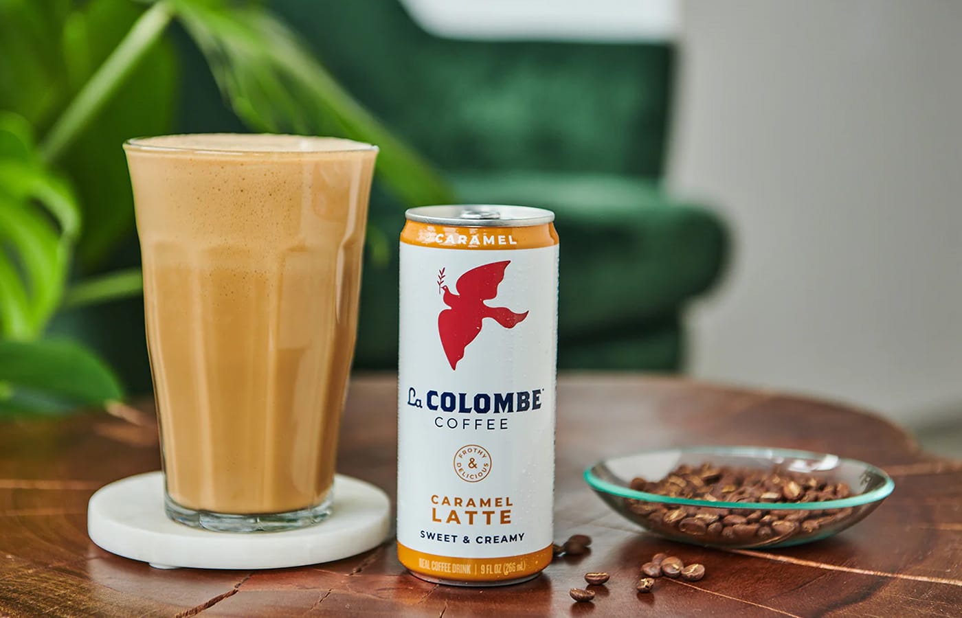
I can’t find out much history on the logo other than the fact that the company has existed longer than the fonts, so it can’t be the original. The industrial feel is often something we might want to emulate in our designs so here are some options you can use to get something similar. I do often find myself reaching for Brothers as a great option as it also includes a bunch of ornaments and words glyphs in the same style to complement it.
Brothers from Emigre, Rigid Square from Dharma Type, Video from Canada Type, Worker from NDISCOVER, Sweet Square Pro from MVB Fonts, and Prohibition from Fort Foundry.
When we switch around the primary fonts here you obviously get a totally different vibe, and while the sharp straight edges are probably not right for Chobani, I could see this softer feel working for La Colombe.
Let me know what you think. Do you want the brands to keep their distinct feel or are you down for some of that soft serif nostalgia for your coffee too?