Dispatch from TypeCon 2023
For the love of letters
Wow oh wow, it has been a long minute since I’ve attended an in person design conference and I am just so invigorated after TypeCon last week. It was such a joy to meet and reconnect with people across the industry. This year the event, which moves around US cities, took place in Portland Oregon (and spoiler alert will also be in Portland next year). You may be wondering what happens at a conference about fonts and typography, and well, keep reading to find out!

I have to imagine conferences across the board are typically filled with like-minded folks passionate about specific areas. Type it turns out is pretty niche, but the value that the people in this room have brought to the world cannot be underestimated. Global communication truly relies on the technologies and typefaces that have been created by these people. The discussions were open minded and with a renewed focus on looking beyond the historically Western focused and insular nature of the industry. If you are interested in learning more about type, I cannot emphasize how great an experience it is to attend such events.
Themes
The SOTA (Society of Typographic Aficionados) team did a great job with the curation and flow of the event and these were the key themes:
- Exploring AI and the implicaitons on the future of type design
- Looking beyond our industry to bring in more perspective
- Less focus on the technology and more on the creativity again
- The challenges of making things seamless for the end user even still with the technology we have
- The both global and political nature of language / communication
Highlights from each day
It’s hard to go over all the content covered so I’ve picked just a few personal highlights from each day to share.
Thursday
The first day was the Education Forum where both educators shared successes and challenges alike, and students presented on their work. It was really great to see such open discussion and sharing of learnings from typographic education and even around post-pandemic mental health issues. The day was interspersed with Q&A and networking slots to further the dialog. It left me feeling very hopeful for the future.
I have to do a call out to Pedro Neves’ talk on Lego Type and his project leading students to learn all about letterpress and type design through a Lego lettering set and small standalone printing presses. Bringing the childlike joy of playing to learning how this all works is pure genius.
Friday
This was the official day one of the conference track and was kicked off with James Edmonson’s (of OH no) keynote on his journey creating an independent foundry and how they can thrive. From serendipitous bar meetings and sibling introductions to CCA (California College of the Arts), to finding the TypeMedia course in The Hague through a blog post on I Love Typography, James shared his story on getting started filled with helpful nuggets. Like how spacing is harder than letters, and how you have to stand out in a saturated market. His answer to the latter is to explore marketing strategies from other disciplines, like video marketing from guitar pedal creators and sharing stories over specimens.
There were just so many stellar talks this day but a few others which I really enjoyed include Kamilé Demir’s overview on what makes a good emoji and the selection process behind them, Peiran Tan sharing his approach at notion to using variable fonts to fine tune complex typography, Grace Spee’s history of type evolution in video games from the 70s to today, and Kamal Mansour’s proposal for a new approach to type classification with variable scales to move away from deterministic classification towards impressionistic classification.
Saturday
Day two did not dissapoint, with another day full of great topics. Neville Brody, the British designer perhaps best known for is graphic work in the 90s, opened the day sharing his work over the years from pre-computer layouts to large-scale modern branding works with Coca-cola and Samsung. He also laid a call to arms around getting back to focusing on some more creative aspects of typography as the technology has finally caught up to enable it yet the web (in particular) often ends up being bland and homogeneous.
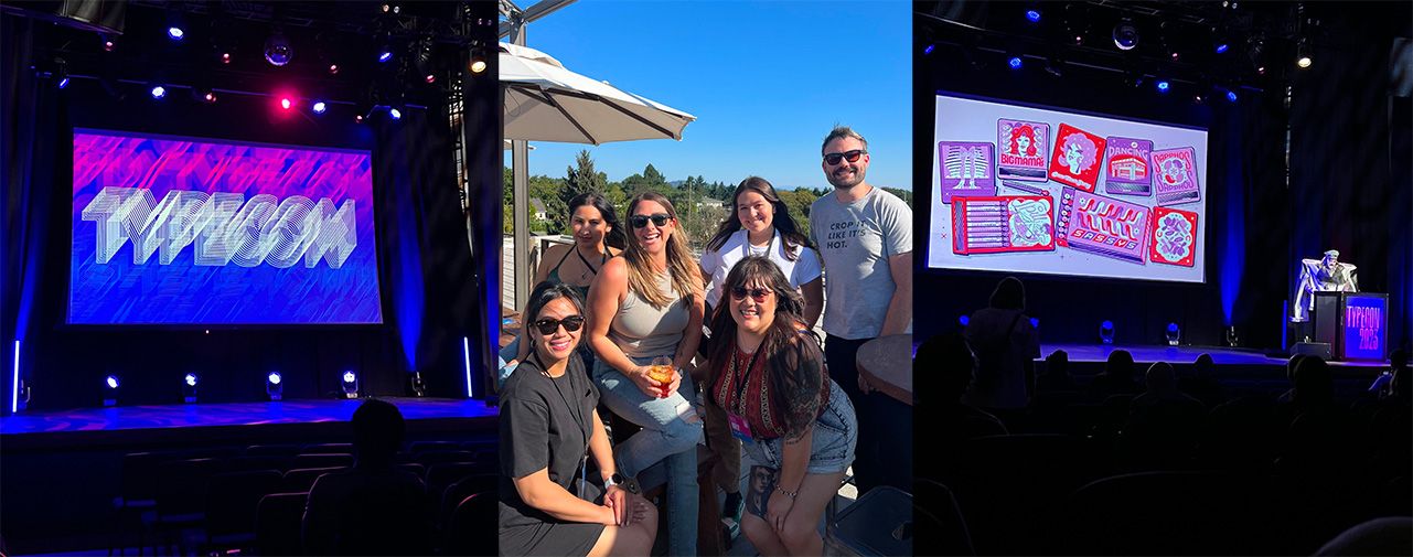
The day was closed out with Kyle Letendre performing as Tomboy sharing how drag has influenced their work as a lettering artist and typographer. It was a visual feast for the eyes supporting queer joy and now holds the bar for every event to have a drag act, please.
A couple of other highlights I have to mention include Alice J Lee’s talk on how the arrival of the creation of the Korean typewriter based on the American typewriter influenced the Korean writing system, and Mark Jamra & Neil Patel’s detailed look at the challenges of designing Arabic type to support African scripts.
Typography is inherently political as it all boils down to communication. There is still a lot to do in our field to make type accessible to all and as Agyei Archer, put it so well, look at the whole supply chain to be more inclusive throughout. It was great to see these topics shared and questioned so thoughtfully along with a punch of inspirational uses for type in design. Thanks TypeCon team!
