Fonts for Coffee

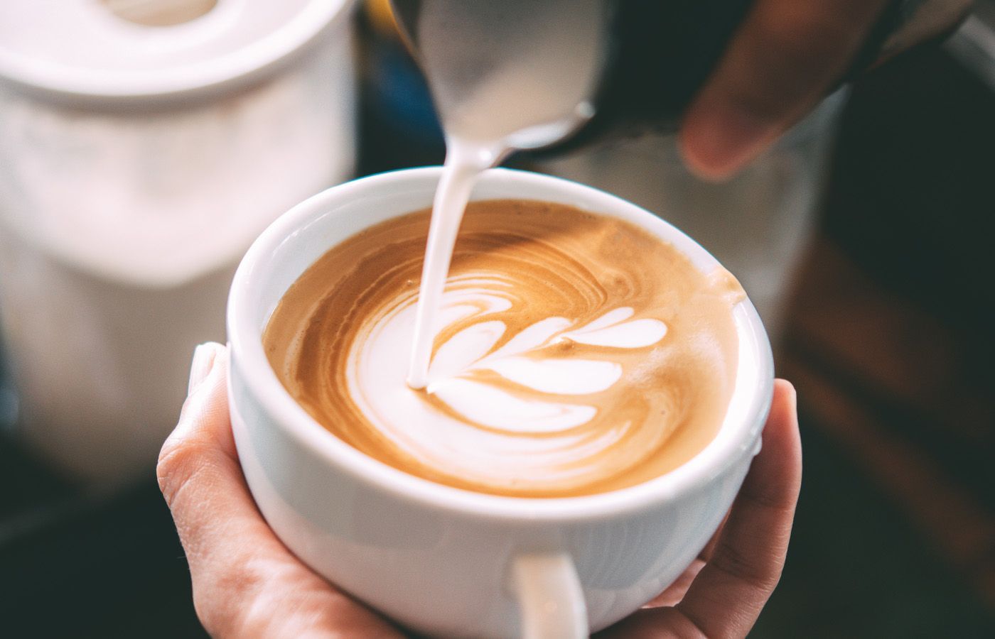
Happy National Coffee Day to those of you in the USA! My big loves in life (after my wife, family, and dog of course) are fonts and coffee. So as I sit here on an unusually gray morning hugging my mug of coffee I’m naturally thinking, ‘what fonts would I use if I had a coffee shop?’
As I noted in my last post in this series, Fonts for Plant Stores, when the subject matter is broad the font choices you make become very subjective and the typography itself comes into to play more. No fonts in the abstract are perfect for ‘coffee’ but when you start to set them in some context you can get a feel for how they could be right. I think it’s also a fun challenge, and good creative warm-up exercise to try out—pick a subject at random and see what fonts you could see yourself using for it. What emotions are you trying to get across with your design? Is there something historical or popular you are trying to evoke? Or maybe the opposite, you want something entirely new. Try to think about your thought process along the way to dissect why decisions feel good.
Here’s what came to me for coffee!
HVD Poster Clean & Sketchnote
HVD Poster Clean from HVD Fonts and Sketchnote from Delve Fonts paired here is emulating bold marker writing on the big canvas coffee bags. I wanted a rustic and handcrafted feel for this one to call back to the natural element of coffee and give a vibe of this being a people focused business.
Rubik & Rig Solid
Clean, Modern, and Minimal with a touch of personality and a nod to signpainting—that’s where I was going with this pairing of Rubik from Google and Rig Solid from Jamie Clarke Type. I could imagine this working well printed on nice re-usable to go cups, and on signage outside of the storefront alike.
Nautica
Here is an ode to one of my go-to espresso drinks, the Cortado. Not too big, not too small, just right. Nautica from Resistenza is bringing the fancy flair to this one. Perhaps a little impractical for use on a menu, unless you can print it nice and large but hey how could you resist ordering one of these when it looks like this! I could also have picked Cortado from XYZ Type but that felt a bit too nail-on-the-head for this example.
Glodok & Serifa
I’ve always liked the idea of naming a coffee shop ‘Gather’ to signify it a place for community. We need more ‘third spaces’ in our lives and I’m always a fan of spending a few hours drinking great coffee, eating a nice pastry, and doing a little bit of work or talking with a friend. Glodok from Sudtipos has such an impact with the heavy strokes, sharp edges, and curious details like the bowl of the ‘A’ and the fun leg of the ‘R’. Serifa from URW Type Foundry plays second fiddle given it’s more neutral (in comparison) features. I like that the slab serif brings enough of its own personality that it could also stand alone.
Field Gothic Narrow & Widescreen
I’m always a sucker for a super narrow + super wide pairing. The start contrast often can be enough to bring things together. Here I’ve used Field Gothic Narrow from Signal Type Foundry and Widescreen from Dalton Maag. I could have used a wide style also from Field Gothic, given it has a lot of different widths and weights, but I wanted to add some extra dimension in the details, like the straight leg of the ‘R’ for example. Using condensed styles is always helpful when you know you might end up having super long product names.
Annabelle JF
I’m in a script mood, what can I say. This time I’ve picked Annabelle JF from Jukebox and played a bit with the styling of the capitals—making them a little larger, and dropping them below the baseline. This gave the nice spot for the ‘o’ to nestle into the ‘C’ and make this feel a bit more custom than just setting the text as-is.
Code Saver
Code Saver from Dharma Type, while clearly designed for code, has the benefits of being very legible and emulating pin board type so I could totally see this being use for signage in a cafe to clearly show the menu.
Coniferous
Using the Touch Type tool in Adobe Illustrator, I’ve manipulated each character here to create this organic arrangement with Coniferous from OH no Type Co. This style was inspired by a few different coffee brands, but when I went back to look at them it was actually nothing anywhere close to them. Funny how sometimes what we remember in our minds eye as inspiration can get entirely changed but still provide a good starting point. Here’s to those hours before the day gets started, where we can (hopefully) enjoy a coffee.
Thanks for reading, and stay caffeinated!