
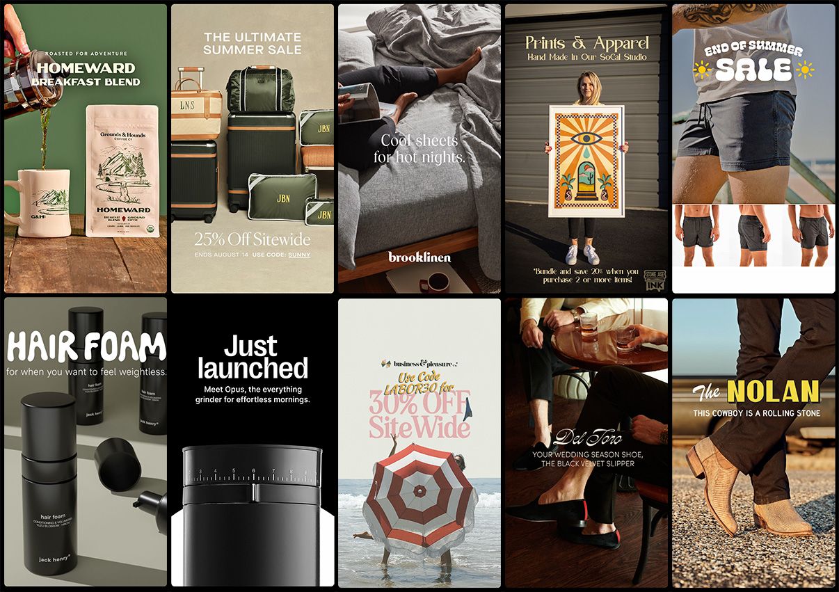
Type inspiration: Instagram Adverts

I don’t know about you, but I inevitably end up spending a lot of time on Instagram every day and well let’s just say I’m a sucker for buying things from adverts on the ’gram. (One time I even bought a house I found on there, but that’s another story.)
Recently I’ve been noticing a bit of a trend in the ads being a bit more type focused and experimenting with more eye-catching typography. Obviously this is nothing new in the advertising world as a whole, but it does feel more fresh for the things I’m used to being shown in social media. Perhaps the rise of tools like Adobe Express is making it more accessible to experiment quickly and easily make these graphics. Either way, I’m digging these and maybe the type can inspire you too! Here’s a few similar options to what I found.
Acme Gothic
Acme Gothic from Mark Simonson Studio is a great high contrast sans serif family with multiple widths and weights at your disposal. It’s pretty square internal curves give it a retro feel.
Commuters Sans
Commuters Sans from Dharma Type is a solid wide sans serif with just enough of a touch of personality. Something about it gives me an air of importance—great for use in marketing then to draw you in.
Superior Title
Superior Title from MCKL keeps coming across my radar and I’m glad for it. It has a mix of sharp serif features, a strong vertical stress on the strokes, and nice rounded terminals in places to bring interest and make it stand out.
P22 Art Nouveau
P22 Art Nouveau from P22 Type Foundry is of course bringing in the Parisian flair with this retro vibe. I couldn’t find anything too close to the ad but this definitely has the same era in focus.
Cheee
Cheee from OH no Type Co. has become a go too for many now to bring a punch of personality and I am all for it. The abundant playfulness livens up and message it is used for.
Solvent
Solvent from PintassilgoPrints is utterly bananas and I love it. It pushes the boundaries of squiggly legibility and looks great when given a faux 3d effect too.
Vinila
Ink traps, a layover from when physical type was printed on paper and ink would expand and become too much in internal corners, have become a much loved feature in digital type. Vinila from Plau is no exception with these, and carries them off nicely.
Adobe Text
Adobe Text from Adobe Originals is, as the name suggests, most typically used for setting body text, hover I’m digging it here used for some larger text too. I was really drawn to the ‘%’ in the original design and this was one of the closer examples I found. Tracking in the text when used larger like this also makes things sit much more interestingly.
Oddity Script
Oddity Script from Resistenza was created from the idea of reversing the contrast of another of their typefaces—Nautica—bringing a new ’70s twist which I absolutely adore.
ATF Brush & Contralto
Vintage vibes are clearly in as can be seen again here with the pairing of ATF Brush from American Type Founders & Contralto from Synthview. Matching the well known ‘brush script’ style again with a high contrast sans serif feels like something straight out of Hollywood.
Inspiration is all around us (even when we’re being persuaded to buy stuff) and with a little digging you can find some similar fonts to emulate the vibe. Save these for later or take a look at your own Instagram stories and see which adverts stand out the most to you and think about why!